
Choosing an interior paint color goes beyond personal taste. Designers consistently gravitate toward shades that perform well in real homes—across different lighting conditions, layouts, and evolving design trends. That’s why certain Sherwin-Williams interior paint colors continue to dominate designer recommendations year after year.
Below are five of the most popular Sherwin-Williams interior paint colors and how interior designers most often use them. These shades are timeless, adaptable, and align seamlessly with current and upcoming interior design trends.
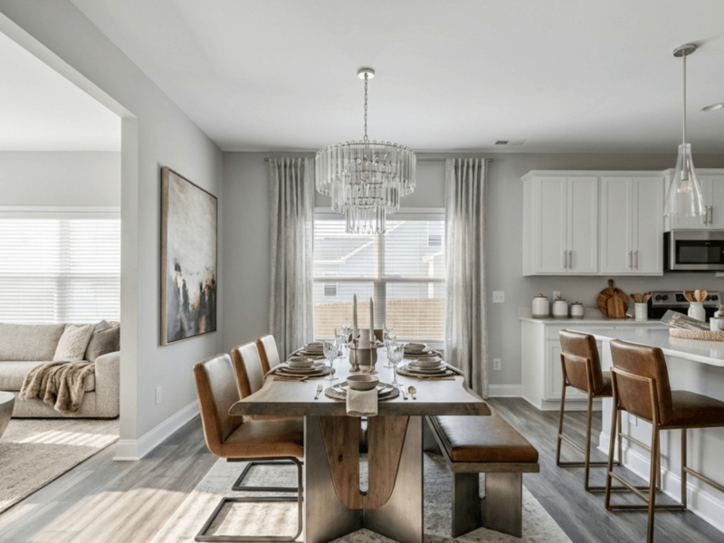
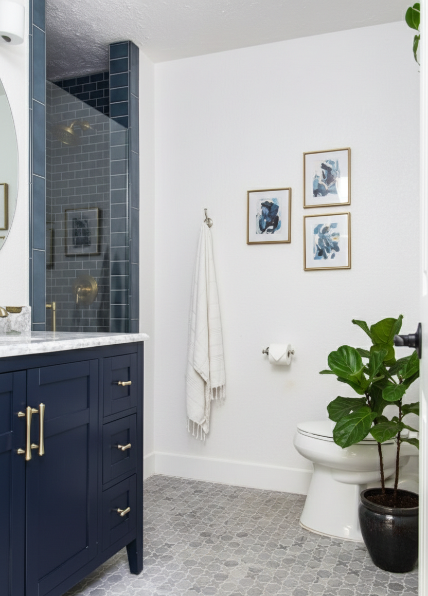
Agreeable Gray (SW 7029)
Agreeable Gray remains one of the most specified interior paint colors among designers—and for good reason. It works effortlessly in living rooms, bedrooms, kitchens, dining areas, bathrooms, and home offices.
Designers favor Agreeable Gray because of its balance. It sits comfortably between warm and cool, making it an ideal backdrop for both traditional and contemporary interiors. In open-concept homes, it helps create visual continuity without making spaces feel flat or repetitive.
As neutral-forward interiors continue to dominate modern homes, Agreeable Gray fits naturally within the broader movement toward calming, livable spaces. Many of the ideas discussed in The Biggest Interior Design Trends for 2026 highlight this ongoing preference for versatile, grounding neutrals that support layered textures and intentional design.
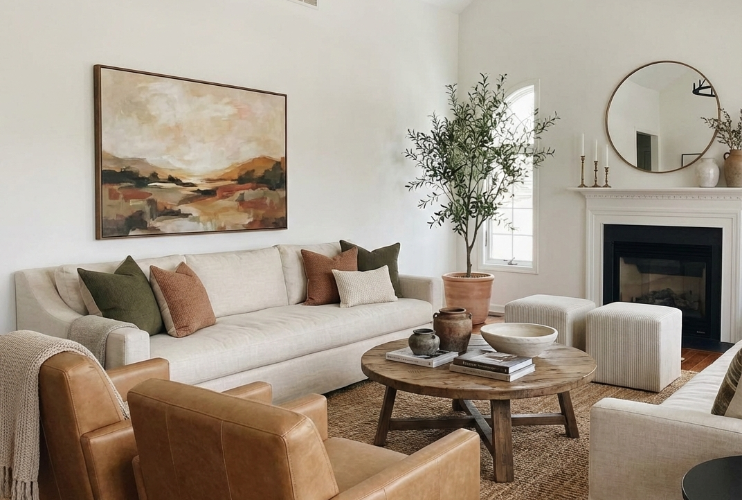
Alabaster (SW 7008)
Alabaster is a warm white that designers regularly recommend for homeowners who want brightness without starkness. It’s commonly used in living rooms, bedrooms, hallways, and open common areas, as well as on cabinetry and trim.
SW Alabaster
Interior designers appreciate Alabaster for its softness. It reflects light gently, helping spaces feel warm, inviting, and comfortable rather than clinical. This aligns with the continued shift toward cozy, human-centered interiors—an approach that’s becoming increasingly prominent in 2026 design trends.
Alabaster works well in homes that favor organic materials, natural light, and subtle contrast, making it a reliable choice for both modern and traditional spaces.
Repose Gray (SW 7015)
Repose Gray is frequently selected by designers for its adaptability. It performs well in a wide range of rooms, including living areas, bedrooms, kitchens, and transitional spaces like hallways and staircases.
SW Repose Grey
One reason designers trust Repose Gray is its ability to respond to changing light throughout the day. It appears lighter in bright spaces and warmer in lower light, which makes it ideal for homes with varied exposure.
As design trends continue to emphasize flow and cohesion throughout the home, Repose Gray supports that goal by serving as a consistent, understated foundation that allows furnishings and finishes to stand out.
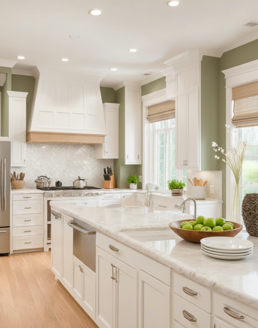
Pure White (SW 7005)
Pure White is considered a staple in interior design. Designers regularly specify it for trim, ceilings, cabinetry, and even walls—especially in kitchens, bathrooms, and modern interiors.
SW Pure White cabinets
Its popularity comes from its balance. Pure White avoids strong undertones, allowing it to pair seamlessly with warm neutrals, grays, and natural materials. Designers often use it to highlight architectural details or create clean contrast against deeper wall colors.
In trend-forward interiors, Pure White supports minimalist aesthetics while still feeling approachable—an important balance noted across many emerging design styles.
Snowbound (SW 7004)
Snowbound is a crisp white with a subtle gray undertone, making it a favorite for designers working in contemporary and transitional spaces. It’s commonly used in kitchens, bathrooms, hallways, and modern living areas.
Designers appreciate Snowbound for its clarity. It brightens spaces without feeling overly cold and works particularly well in homes that feature cooler palettes, clean lines, and intentional simplicity.
SW Snowbound walls
As interiors move toward refined minimalism and thoughtful contrast, Snowbound continues to show up in designer specifications for its ability to feel fresh yet timeless.
How Designers Use These Colors Together
Interior designers often combine these Sherwin-Williams shades to create cohesive color palettes throughout a home. Agreeable Gray and Repose Gray frequently anchor main living spaces, while Pure White or Snowbound are used for trim and ceilings. Alabaster is often introduced when a softer white is needed to balance texture and warmth.
These combinations align closely with the interior design direction outlined in The Biggest Interior Design Trends for 2026, where intentional layering, neutral foundations, and flexibility are key themes.
Choosing Colors That Last
While trends evolve, these Sherwin-Williams interior paint colors remain popular because they adapt. They support changing décor, shifting styles, and long-term livability—making them smart choices for homeowners who want interiors that feel current without chasing short-lived trends.
When chosen thoughtfully and applied with proper preparation and finish selection, these colors create interiors that feel cohesive, comfortable, and designed to stand the test of time.
Before you finalize your color palette, we’d love to hear from you.
Are you more drawn to classic, timeless shades—or do you prefer following emerging interior design trends?
Drop your pick in the comments and tell us why.