The colors used in a classroom have a measurable impact on how students feel, behave, and learn. For Metro Atlanta charter and independent schools, choosing the right paint colors isn’t just a design choice—it’s a strategic decision that influences focus, mood, creativity, and overall learning outcomes. Studies in environmental psychology, cognitive science, and educational design consistently show that color affects:
To help school leaders make smarter facility decisions, here are the best classroom painting ideas Atlanta schools can use to support academic performance and a healthier learning environment — backed by credible research and aligned with K-12 best practices.
For full guidance on process, timing, safety, and planning, explore the Ultimate Guide to Painting K-12 Charter & Independent Schools in Atlanta.
1. Soft Blues and Blue-Greens Improve Concentration
Blue is one of the most research-supported colors for boosting focus, calmness, and sustained attention.
A well-known study from the University of British Columbia, published in Science, found that blue environments improve cognitive performance and attention-focused tasks, especially compared to red environments (Mehta & Zhu, 2009).
Best For
Why it work
Blue tones lower heart rate and reduce overstimulation, helping students stay attentive. Blue-green variations mimic natural settings, which further supports cognitive recovery and mental endurance.
Best Shades
Avoid
Highly saturated or neon blues, which can feel visually overwhelming.
2. Calming Greens Support Emotional Regulation
Green is widely associated with balance, restoration, and reduced anxiety.
A multi-experiment review in Color Research & Application found that green environments reduce stress and support emotional stability (Küller, Mikellides & Janssens, 2009).
Additional studies show green tones can improve reading fluency in younger learners.
Best For
Best Shade
Greens perform well under both natural and artificial lighting — especially helpful for older Metro Atlanta school buildings with limited daylight.
3. Warm Neutrals Improve Comfort and Reduce Overstimulation
A major study from the University of Salford (“Clever Classrooms”) found that overly saturated colors increase cognitive load and overstimulation, especially in younger students (Barrett et al., 2015).
Modern learning environments now use warm neutrals as the base color:
Why it works
Neutral backgrounds reduce visual noise, support teacher displays, and help create emotionally stable learning environments.
4. Strategic Accent Colors Boost Engagement (Used Sparingly)
When used correctly, accent colors can elevate engagement and memory.
The American Psychological Association highlights that color influences emotion and memory recall (APA, 2023) — but only when used purposefully.
Good accent choices
Good accent choices
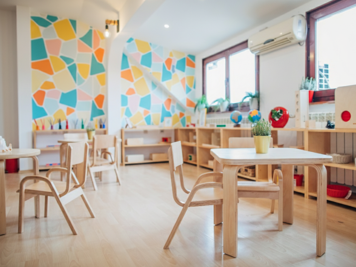
5. Color-Coding Supports Wayfinding and Classroom Identity
Color coding is one of the simplest, most effective improvements for large Metro Atlanta campuses.
Research from the National Clearinghouse for Educational Facilities shows that color-based wayfinding improves student navigation and reduces stress, particularly for younger learners (NCEF Report).
Examples
This strengthens culture and creates a campus that’s intuitive to navigate.
6. Consider Light Reflectance Value (LRV) in Older Buildings
Lighting plays a crucial role in learning outcomes.
The Heschong Mahone Group studied over 21,000 students and found that daylight-optimized classrooms improved reading and math scores by 20–26% (HMG, 2003).
Because many Metro Atlanta charter and independent schools operate in older facilities, using high-LRV colors helps:
Low-LRV colors should stay as accents only.
7. Select Low-VOC Paints for Healthy Learning Environments
Indoor air quality directly impacts concentration and student well-being.
The EPA’s Indoor Air Quality Guide for Schools warns that VOCs can cause headaches, fatigue, and reduced cognitive performance (EPA IAQ Guide).
Additionally, UL GREENGUARD notes that low-VOC paints reduce chemical emissions and support healthier indoor environments — especially important for schools (GREENGUARD Certification).
Your school pages already highlight your commitment to clean, safe, low-odor painting solutions for academic environments. These findings reinforce why low-VOC products must be standard in all K-12 projects.