
When patients walk into your clinic, they’re quietly asking two questions:
- “Do I feel safe here?”
- “Do these people really care about me?”
Your paint colors play a bigger role in that answer than most practice owners realize.
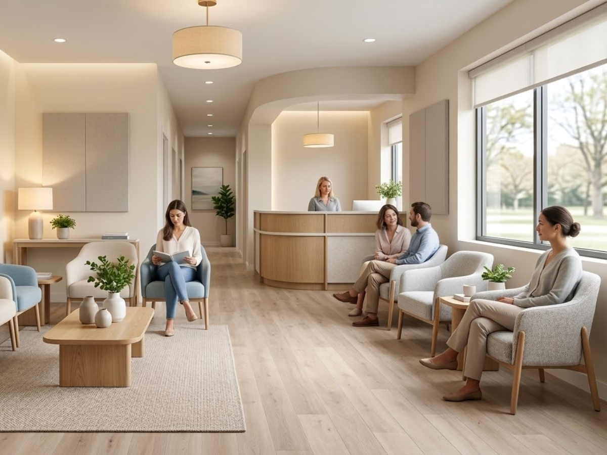
In busy healthcare corridors like Buckhead, Sandy Springs, Midtown, Brookhaven, Ansley Park, and Virginia-Highland, patients are used to comparing experiences. They notice when one waiting room feels harsh and clinical while another feels calm, clean, and thoughtfully designed. The right color palette can lower anxiety, support your brand, and even influence what patients say in their online reviews.
In this guide, we’ll walk through how color psychology applies to healthcare spaces, how it affects both patients and staff, and which colors work best in Atlanta clinics and waiting rooms.
Why Color Psychology Matters in Healthcare Spaces
Healthcare is already stressful. People come in with pain, fear, uncertainty, or frustration. The environment shouldn’t add to that; it should gently dial that stress down.
Color psychology isn’t “fluffy design talk”—it’s about how the built environment helps:
- Lower perceived wait times
- Reduce anxiety
- Improve clarity and wayfinding
- Support a sense of cleanliness and professionalism
In a market as competitive as Metro Atlanta, those details directly affect patient satisfaction. In fact, we’ve already seen how finishes and color choices influence feedback in our article “How Paint Impacts Online Reviews and Patient Perception.” When patients describe a space as “cold,” “dingy,” or “outdated,” they’re often reacting to paint colors and lighting before anything else.
The good news? You don’t need a full renovation to shift that perception. Thoughtful repainting, guided by color psychology, can completely reset the mood of your clinic or waiting room.
How Different Colors Affect Patients and Staff
You don’t have to memorize theory, but it helps to understand some basic emotional responses to common colors in healthcare environments.
Blues
- Perceived as: calm, trustworthy, professional
- Good for: waiting rooms, exam room accent walls, staff work areas
- Avoid: very dark or cold blues that feel corporate or depressing
Greens
- Perceived as: natural, restorative, balanced
- Good for: waiting rooms, family areas, wellness and therapy spaces
- Avoid: neon or overly saturated tones that feel artificial or “cartoonish”
Neutrals (warm whites, soft beiges, greige tones)
- Perceived as: clean, modern, flexible
- Good for: walls in hallways, exam rooms, and reception areas
- Avoid: stark hospital white—it can feel sterile, unforgiving, and highlight every scuff
Soft Terracottas / Muted Corals
- Perceived as: warm, human, welcoming
- Good for: reception desks, small feature walls, pediatric-friendly touches
- Avoid: strong reds and bright oranges that can feel urgent or agitating
Grays
- Perceived as: sophisticated, modern—but only when done right
- Good for: trim, doors, or balancing brighter colors
- Avoid: heavy, cool grays everywhere; they can make spaces feel gloomy, especially on cloudy Atlanta days
The key is balance. Most Atlanta clinics do best with a neutral base + one or two calming accent families, not five different competing colors across the suite.
Practical Color Recommendations for Atlanta Clinics and Waiting Rooms
Now let’s bring this down to earth with some specific use cases we see in clinics and medical offices across Buckhead, Sandy Springs, Midtown, Virginia-Highland, and surrounding neighborhoods.
1. General Family & Internal Medicine Clinics
For family medicine practices—from Brookhaven to Ansley Park—patients span every age and background. You want calm, not sleepy; clean, not “hospital stark.”
Good starting palette:
- Walls: warm off-white or soft greige
- Accent walls: muted blue-green or soft slate blue
- Trim: clean, slightly warm white
This combination feels professional enough for serious conversations, but not intimidating.
2. Pediatric Clinics
Bright primary colors everywhere might sound fun, but in real life they tend to overstimulate kids and exhaust parents.
Think friendly, not frenetic:
- Walls: soft warm white or light beige
- Accents: dusty teal, soft coral, muted mustard in small doses
- Graphics: wall decals or murals to carry the “fun,” while paint stays calmer
This makes your waiting room feel playful and soothing—especially important for children on the spectrum or with sensory sensitivities.
3. Behavioral Health, Counseling & Wellness Practices
In Midtown, Virginia-Highland, and similar neighborhoods, many counseling centers and wellness practices lean heavily on environment to support their brand.
For these spaces:
- Walls: desaturated greens or blue-greens (think eucalyptus, not Kelly green)
- Accents: warm neutrals, muted clay, very soft blush tones
- Avoid: high contrast color pairings and sharp, bright tones
Here, the job of color is to signal: “You’re safe here, you’re heard, and you can relax.”
4. Urgent Care & High-Turnover Clinics
Urgent care centers in places like Sandy Springs or Buckhead need to communicate speed, cleanliness, and efficiency without feeling cold.
Effective approach:
- Walls: clean, warm white with excellent light reflectance
- Accents: confident but not aggressive blues, blue-greens, or soft charcoal
- Doors and trim: slightly deeper neutral to hide scuffs and traffic
Pairing this with easy-to-clean, higher-sheen paints in high-traffic areas keeps the space looking fresh between repaints.
Making Color Work for Your Atlanta Clinic
Color psychology is most effective when it’s integrated into a bigger plan:
- Your brand (logo, message, population served)
- Your neighborhood (Midtown vs. Sandy Springs may have different expectations)
- Your patient mix (pediatrics vs. geriatrics vs. behavioral health)
- Your operational reality (how busy you are, how often you can repaint)
If your waiting room feels dated, harsh, or forgettable, a thoughtful repaint can completely change how patients experience your space—and what they say about you online. As we explored in “How Paint Impacts Online Reviews and Patient Perception,” patients rarely separate clinical care from environmental experience. They judge the whole package.
The right colors can quietly:
- Lower anxiety before appointments
- Improve staff satisfaction in long-shift environments
- Reinforce your brand as modern, attentive, and detail-oriented
- Support better first impressions in competitive Atlanta markets
If planning a painting project, read the guide we made for healthcare facility managers: Ultimate Guide to Painting Healthcare & Senior Care Facilities in Atlanta
If you’re ready to rethink the look and feel of your clinic in Buckhead, Sandy Springs, Brookhaven, Ansley Park, Midtown, or Virginia-Highland, we can help you choose a palette that works in real life—not just on a paint chip. Get a quote for your clinic repaint.