
When it comes to preparing a home for sale, one of the most overlooked details is how colors flow from room to room. A cohesive color story doesn’t just make a space look more intentional—it helps buyers imagine themselves living there. Whether you’re staging a home in Suwanee, Duluth, Vinings, or Brookhaven, or working on a full interior redesign, getting color right is key to creating emotional connection and visual harmony.
Why Color Flow Matters
Buyers often make emotional decisions within seconds of walking in. When colors clash from room to room, it can make a home feel smaller, busier, and less inviting. On the other hand, a consistent palette creates a sense of calm and continuity.
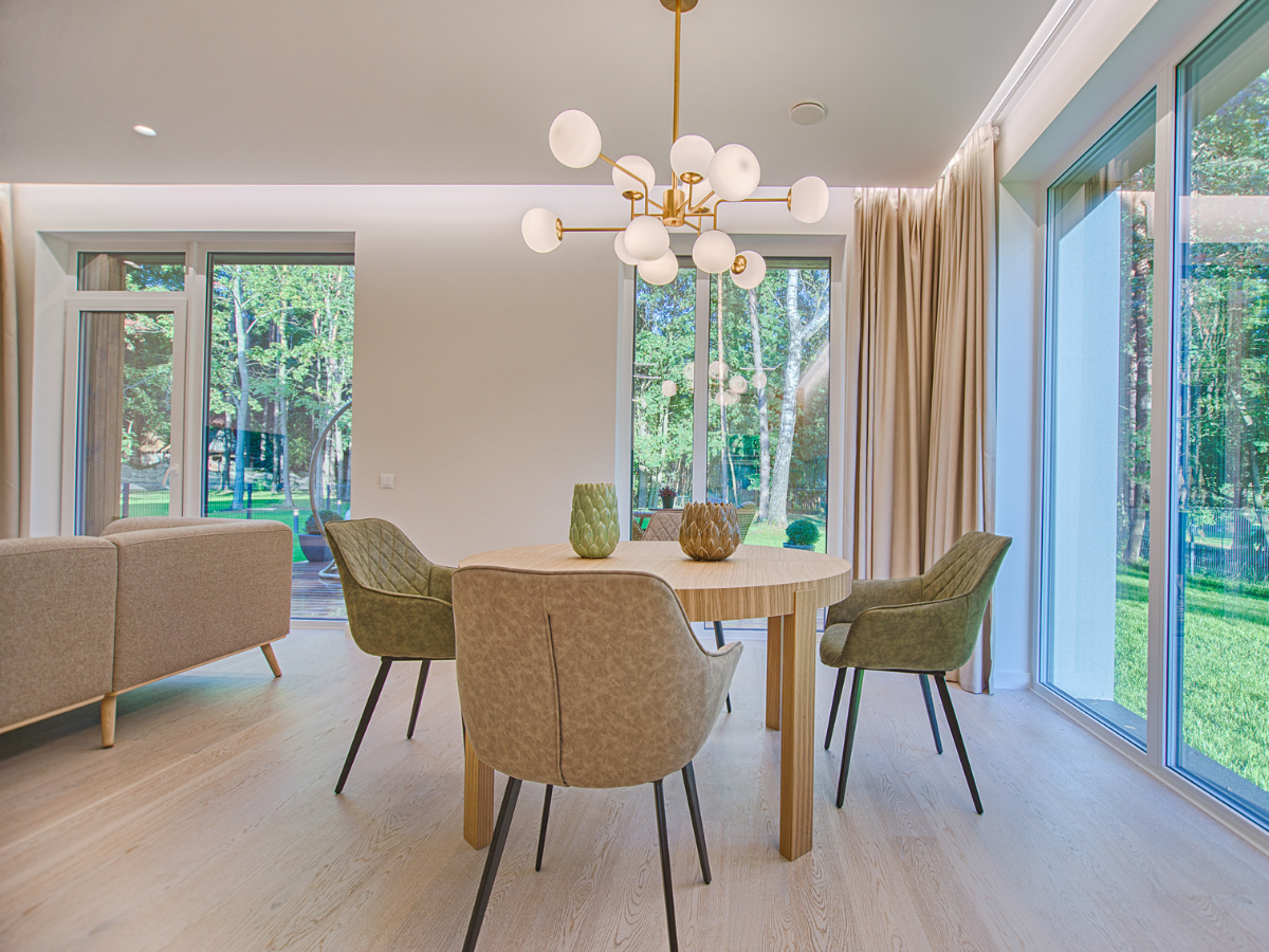
Professional painters in Atlanta understand that the right tones can visually link spaces—even if each room serves a different function. For example, the transition from a soft greige living room to a muted green bedroom can feel seamless if both shades share similar undertones.
Start with a Base Hue
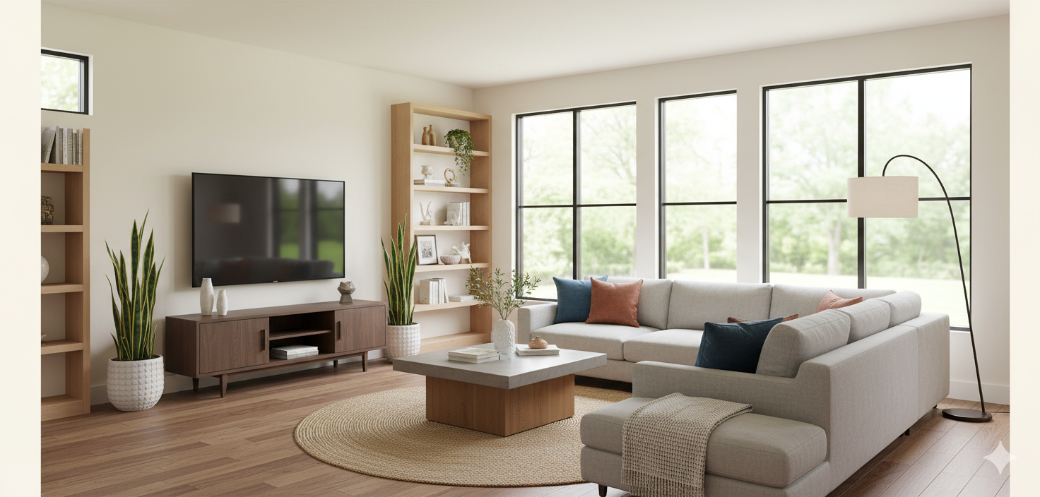
Every cohesive palette begins with a base color. This is usually a neutral tone that sets the tone for the rest of the home. Popular choices for Atlanta listings include warm whites, soft taupes, and light greiges—versatile shades that complement a wide range of furnishings and lighting conditions.
A favorite among real estate professionals is Sherwin-Williams Alabaster (SW 7008)—a warm, creamy white that works beautifully in natural light. Another solid option is Benjamin Moore Edgecomb Gray (HC-173), offering a balance between cool and warm undertones.
Once the base hue is selected, you can layer in color variations or accent tones to create depth and personality without breaking harmony.
Sherwin-Williams Alabaster
Use the 60-30-10 Rule
This timeless design principle keeps interiors balanced and visually pleasing:
- 60% dominant color (walls)
- 30% secondary color (furniture or cabinetry)
- 10% accent color (decor, art, or trim)
Applying this formula across multiple rooms allows each space to have its own identity while maintaining a unified aesthetic. For example, you might use a consistent wall color throughout, changing accent shades as you move from one room to another.
Consider Natural Light and Orientation
Lighting plays a huge role in how color appears. Homes in Atlanta’s neighborhoods like Vinings and Decatur often have a mix of north- and south-facing rooms, which can make colors shift dramatically throughout the day.
- North-facing rooms: tend to feel cooler—use warm neutrals or soft earth tones.
- South-facing rooms: receive warmer light—muted blues, greens, or grays can balance brightness.
Testing paint samples in each room and observing them at different times of day can help ensure consistency across spaces.
Create Subtle Transitions
A cohesive palette doesn’t mean every room must be painted the same color. It’s about flow, not repetition. Consider using colors from the same family but with slight tonal variations.
For instance:
- A warm white in the entryway
- A greige or soft sage in the living room
- A dusty blue in the bedroom
These transitions feel natural, especially when undertones align. Connecting trim, ceilings, or doors with a consistent color also ties the design together beautifully.
Link to Purpose and Mood
Each color affects how a space feels—and in real estate, that translates to how a buyer experiences the home. For instance, soft blues and greens promote calm in bedrooms, while richer tones like clay or mocha feel grounding in offices or dining rooms.
If you’re interested in how color psychology can influence buying behavior, explore our post “Color Psychology: What Paint Tones Help Sell a Home”, where we break down how strategic color choices can impact real estate success.
Common Mistakes to Avoid
- Using too many bold colors: It can overwhelm buyers. Stick to two or three main hues.
- Ignoring undertones: A beige with pink undertones might clash with a gray that leans green.
- Forgetting about finishes: Consistent sheen (e.g., eggshell on walls, satin on trim) contributes to a polished look.
The Power of Professional Application
Even the best palette loses impact without proper execution. Professional painters in Buckhead and surrounding Atlanta areas know how to balance finishes, lighting, and wall prep to ensure colors look their best in every room. A cohesive color story deserves a flawless finish—because details sell homes.
Final Thoughts
Creating a cohesive color story is part art, part strategy. For homeowners and real estate agents, it’s one of the simplest ways to elevate perceived value without major renovations. A well-painted home feels intentional, move-in-ready, and memorable.
If you’re planning to stage, redesign, or refresh a multi-room property, start with color. The right palette can transform how buyers experience every space—from first impression to final walkthrough. We can help you with the transformation!
What’s your go-to color for creating flow between rooms? Share your thoughts in the comments—we’d love to hear how you bring harmony into your designs.